- Featured
B2B Edition
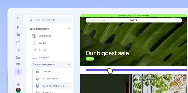
Advanced B2B features for enterprise plans.Catalyst
NewCreate stunning, high-performing storefronts that captivate and convert.Feedonomics
Omnichannel feed and data transformation.Multi-Storefront
Manage multiple unique stores from one account.International
Grow your brand across the globe.
- Launch Services
Overview
Chart your path to success with specialised services.Implementation Project Management
Experts to ensure you launch on time and under budget.Solution Architecture
Seasoned advisors to help you best design your store.Data Migration & Optimisation
Expertise on a clean and clear path to migrating your data.Enterprise Launch Package
Personal training on how to set up and launch your BigCommerce Store.
Professional Services Blog Series
Get to know our teams and how they support your success in this Q&A series.

The Global B2B Buyer Behavior Report
This in-depth report provides actionable strategies to help you sell more online.
The BigCommerce Blog
Actionable insights to help you stay on the cutting edge of ecommerce.