- Featured
B2B Edition
Advanced B2B features for enterprise plans.Catalyst
NewCreate stunning, high-performing storefronts that captivate and convert.Feedonomics
Omnichannel feed and data transformation.Multi-Storefront
Manage multiple unique stores from one account.International
Grow your brand across the globe.

- Launch Services
Overview
Chart your path to success with specialised services.Implementation Project Management
Experts to ensure you launch on time and under budget.Solution Architecture
Seasoned advisors to help you best design your store.Data Migration & Optimisation
Expertise on a clean and clear path to migrating your data.Enterprise Launch Package
Personal training on how to set up and launch your BigCommerce Store.

Professional Services Blog Series
Get to know our teams and how they support your success in this Q&A series.

The Global B2B Buyer Behavior Report
This in-depth report provides actionable strategies to help you sell more online.
With 1 in 4 Online Dollars Spent on Mobile, Ecommerce Mobile SEO is More Important [& Intricate] Than Ever
By the time you read this, everything we’ve learned about mobile SEO could be wrong.
This is because the existing paradigm is based on a desktop-first world, and Google is about to catapult us into a mobile-first world with a major update on how they crawl, render and rank the web.
Even the “Mobilegeddon” update of 2015, which promoted “mobile friendly” sites in the search results, did not approach the importance of what’s about to happen.
Google has already begun testing a mobile-first index that not only rewards mobile-friendly websites, but ranks the desktop version based on content it finds on the mobile version.
Until now, it has been the other way around.
Google’s Mobile-First Index
In July 2019, Google will begin using a mobile-first index.
Why the change?
When was the last time you checked your phone?
Probably pretty recently.
You may even be reading this blog post on your phone. Afterall, checking your phone is the new normal.
According to Deloitte’s U.S. mobile consumer survey results, Americans check their phone 47x per day.
And those browsers are buying on mobile, too.
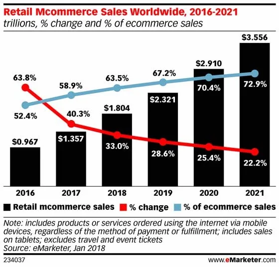
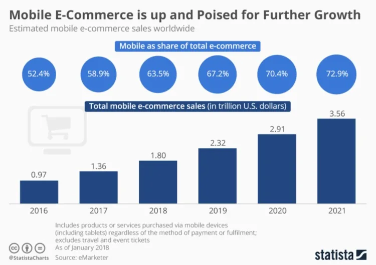
Mobile commerce sales totaled $1.357 trillion in 2017, making up 58.9% of digital sales — a large jump in share from 40.2% in 2015.
In 2019, mobile commerce sales are projected to grow to 63.5% of total ecommerce sales. That’s $1.804 trillion in revenue.
As both phone usage and mobile commerce sales grow, so does the importance of mobile SEO.
Your potential customers need to easily find your website. Then, once they find it, they expect a seamless user experience.
Those are givens –– but despite all of us being mobile users (and experts at that), it isn’t always easy to nail a mobile-friendly strategy.
Today, we’ll go through:
The history of mobile ecommerce SEO and websites.
Exactly how to prepare for Google’s Speed Update in July 20109 (or how to buffer yourself from it)
What both Google and consumers consider a mobile-first experience (i.e. seamless and convenient)
What you should look for in ecommerce technology to make sure you aren’t doing all the legwork here
Let’s dive in.
Five Generations of Mobile Website Development
First Generation: Subdirectories and subdomains, with or without forced redirects.
Back when mobile was an afterthought for most businesses, many chose to go the subdomain route, often using tools to auto-generate a mobile version of their site based on the desktop version.
This is definitely a desktop-first strategy.
Second Generation: Responsive design based on a fluid / stackable grid pattern.
Responsive design filled the gap between desktop and mobile experiences for several years, and is still the go-to solution for most businesses.
No matter what size your screen is, the content will restack and resize to provide a decent visual experience for the users.
However, it is still very much a desktop-first approach to mobile websites.
Third Generation: Responsive web design with Adaptive Logic
This setup typically “adapts” content, features or design for mobile users.
Most use responsive web design as the base, and then customize features for mobile users with client-side JavaScript. You should be able to see missing/added content by viewing the source code if this is the case.
While not a mobile-first approach, it’s definitely a step closer to giving mobile visitors the custom experience they need.
The Rise of Mobile-First Sites
Forward-thinking developers and designers are no longer building for desktop and then adapting that version for mobile. Instead, they’re building for mobile and adapting it for desktop.
Most of the time (so far) we see this being done as a responsive layout with adaptive logic.
A good example of this comes from Zyppah, which shows a “hamburger” style navigation menu and a single-column layout to desktop visitors.
Desktop visitors see a bigger version of the mobile site, complete with the same header-bar offer.

Zyppah desktop view
Sephora goes beyond current best practices on mobile to give visitors an easier way to navigate their site than traditional “hamburger” menus.
Not only can mobile users swipe left or right to see more top-level categories, but the hamburger menu itself reveals a sophisticated mega menu that makes navigating to deep categories on mobile just as easy as it is on desktop.
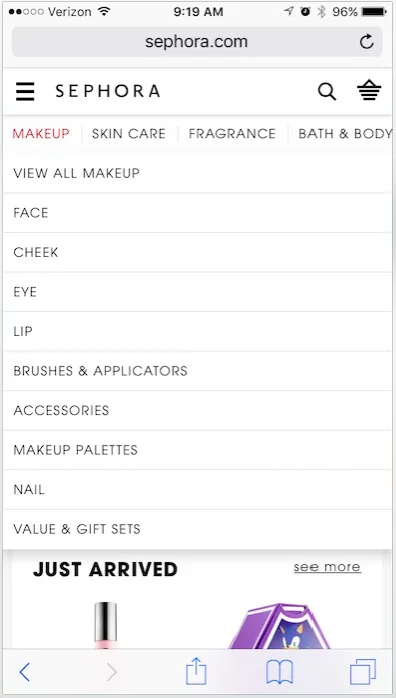
Sephora combines a mobile-friendly menu with the ‘mega menu’ features their desktop users are familiar with.
Even smaller brands are choosing mobile-first over desktop.
When Brandon Chatham, owner of NatoMounts, went to redesign his site – he refused to settle for a desktop-first version.
Instead, he worked with a designer to first create a mobile version of the site, and then work to create a desktop responsive version.
“Desktop design is such an after the fact. It’s so minimal, these desktop visitors now, that we need to stop making desktop so important,” says Chatham.
“If you look at all your store traffic, I could probably guarantee you that mobile is now over that of desktop. If that’s the case, if 51% or 60% or 70% of all visitors across your website are now on mobile, that should cause a shift for the way your focus your attention.
It should just be all around mobile.”

NatoMounts’ mobile homepage.
Fourth Generation: Fully dynamic web design
Here desktop (and sometimes tablet) users are dynamically served different content than mobile users.
This is typically accomplished with server-side logic, meaning desktop-only content won’t show up in source-code view on mobile devices, and vice versa.
The main benefit of a fully dynamic website is complete control over the user experience across devices without changing URLs. This is important for obtaining optimal conversion rates across devices.
The biggest drawback of fully dynamic setups has to be the added maintenance. You could be dealing with two completely different websites, but only one URL per page.
This makes design, content production, implementation and upkeep twice as difficult. It also creates unique challenges to SEO, including the use of a Vary: User-Agent response in the HTTP header and the caching difficulties it may create.
Fifth Generation: Single Page Application (SPA) websites
This is where we’re headed.
In fact, many retailers have already gone this route. The image below shows the growth of JavaScript frameworks and libraries by plotting tags on Stack Overflow.
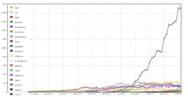
Angular use has skyrocketed since early 2013.
The growth in use of Angular.js is so extreme it obscures the impressive growth other JavaScript technologies have enjoyed:
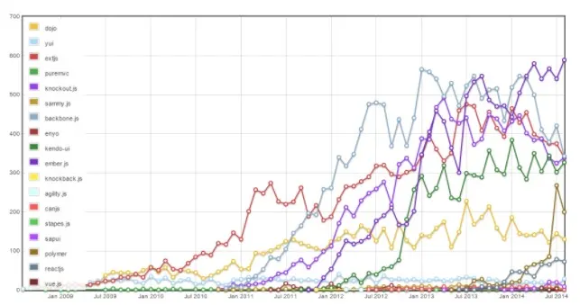
Javascript technology growth with Angular.js removed.
It will be interesting to see how React.js performs in 2019, judging by the amount of developers switching and migrating from Angular.js to React.js.
There is a big window for React.js to take over the lead with the latest developments in isomorphic JavaScript rendering, which solves a lot of SEO problems around server-side versus client-side rendering.
Currently React.js uses it, but Angular.js does not.
Do You Even Need an “APP” Now?
Vendor-specific app marketplaces like Apple’s iTunes and Google’s G Suite may become obsolete as Apps can be run without downloading them, unlike those found in common app marketplaces.
Important Factors of a Mobile SEO Strategy in 2020
Mobile SEO refers to search engine optimization tactics and best practices to help a mobile version of a website rank on search engines.
Traditional SEO tactics and best practices are still hugely important, but there are aspects of SEO that are specifically geared towards helping you rank your mobile websites.
Mobile SEO is all about making your site easy to crawl so Google can easily understand it’s content and serve the correct pages to users.
When creating and implementing your SEO strategy, take the following into consideration to help ensure that your website ranks on mobile devices:
1. Ensue your website is configured for mobile users.
Google suggests using one of 3 ways to implement a mobile website:
Responsive design,
Dynamic serving.
Using separate URLs.
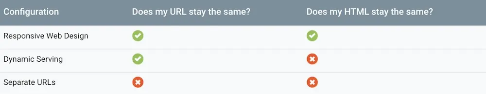
Although each of these types of implementations work, Google specifically recommends using responsive design for mobile websites.
The advantage of responsive design is that you are able to serve the same HTML code regardless of the users device.
The look and feel of the website changes based on screen size, but the code will the same.
2. Understand the mobile-first index.
Google has started rolling out mobile-first indexing.
Mobile-first indexing means that the mobile version of a website will be the baseline for how Google indexes your site determines your rankings.
When a website is switched, webmasters will be notified from Google, and will have an increased crawl rate from the Smartphone Googlebot.
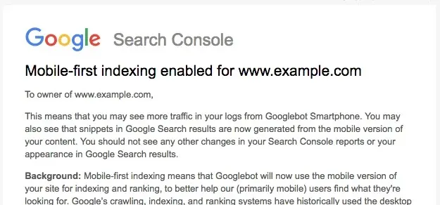
According to Google, responsive websites do not have much to worry much, because the site’s HTML code will remain the same.
However, all sites should keep these mobile-first indexing best practices in mind to have on both the mobile and desktop versions of your site:
Equivalent text, images (with alt attributes), and videos for mobile and desktop versions.
Structured data.
Title tags, meta descriptions and other metadata.
Correct canonical tags.
Ensure Smartphone Googlebot can access your pages.
3. Mobile page speed optimization.
Page speed has always been important for SEO.
Google announced using site speed as a metric for ranking back in 2010 and officially announced in January 2017 that mobile page speed is a ranking factor for websites.
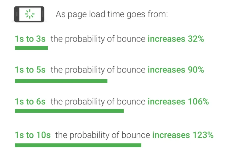
This makes perfect sense with the rise of mobile users. Multiple studies show the importance of mobile page speed and how it affect bounce rates and conversions.
As shown in the image below, a Google study shows that the slower your mobile site, the higher the probability that a user will bounce.
Additional Google research found that sub-par experiences on mobile make consumers 62% less likely to purchase from a site in the future.
Luckily, Google provides a checklist to help users that include the following page speed optimizations:
Avoid landing page redirects.
Enable compression.
Improve server response time.
Leverage browser caching.
Minify resources.
Optimize images.
Optimize CSS Delivery.
Prioritize visible content.
Remove render-blocking JavaScript.
4. Put focus on mobile usability.
Usability is very important for a mobile website.
According to Google, a one second delay in mobile load time can hurt conversions by up to 20% on retail websites.
Although, bounce rate and CTR are not official Google ranking factors, there is typically a strong correlation between high ranking websites.
The better user experience the more likely it is that your website is going to convert.
Here are a few recommended way to put your customers first and deliver a seamless experience:
Make your site mobile site is easy to navigate.
The mobile-version of your site it easy to read. Typography needs legible and look good.
Ensure there is enough room between clickable elements.
Don’t make users pinch and zoom.
Make your buttons are large enough.
Ensure users can use contact forms.
CRO is huge for understanding users. Test to see how users interact with the mobile version of your site.
5. Use structured data markup.
Structured data markup is used by Google to understand the content of a page and to gather more information about the web and the world in general.
Structured data can also enhance SERP appearance to help click through rate.
There are many types of markup included based on the type of website you have including:
Articles and more.

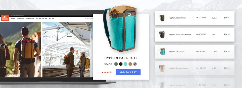
For example, BigCommerce customer product pages, will show review stars, rating and number of reviews in the SERP.
The more structured data markup the better!
Just make sure it is implemented properly using Google’s Structured Data Testing Tool to get the markups full value.
Also, don’t create spammy markup to trick Google. Google can apply a manual action to your site, which can hurt your rankings.
Here is Google’s official structured data markup documentation.
6. Stick to the basics.
Mobile SEO is important, but at the end of the day it comes back to the basics.
SEO best practices, like keyword research, optimizing meta tags, creating high quality content and external link acquisition are still what moves the needle.
Our ecommerce SEO guide goes into more detail about recommended tactics.
7. Prepare for voice search.
Voice search is rapidly growing in popularity.

More and more people are using Alexa, Google Now and Siri to find answers to their questions with spoken word rather than typing in a search query.
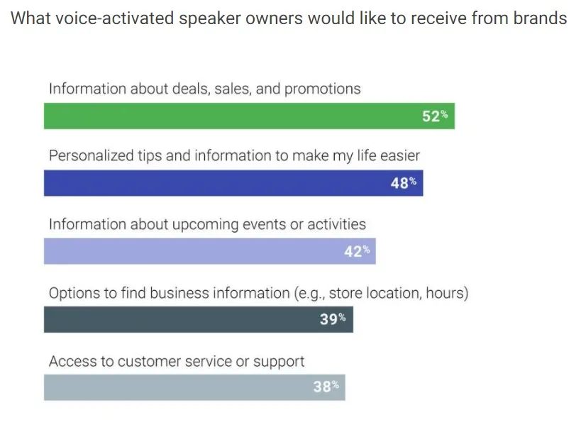
From Baby Boomers to New Parents, voice-activated speakers are driving sales and adoption in hoards.
51% of those 55 years old and over said a top reason for using their voice-activated speaker is “it empowers me to instantly get answers and information.”
72% of parents who own voice-activated speakers said they are likely to use them to buy something in the next month.
76% of parents say they typically use their devices while doing other things
And here is what those folks are looking for from their voice-activated speaker, according to Google:
With the growth of m-commerce, this is especially important for ecommerce websites.
According to research by Backlinko in which the brand analyzed 10,000 Google Home searches:
Page Speed seems to play a role in voice SEO (this is great for BigCommerce merchants).
Results are typically secure websites: 70.4% of Google Home result pages are secured with HTTPS.
Google prefers short, concise answers to voice search queries. The typical voice search result is only 29 words in length. But, the average word count of a voice search result page is 2,312 words. Therefore, Google tends to source voice search answers from long form content.
The average Google voice search result is written at a 9th grade reading level.
Content with high levels of social engagement tends to perform well in voice search. In fact, the average voice search result has 1,199 Facebook shares and 44 Tweets.
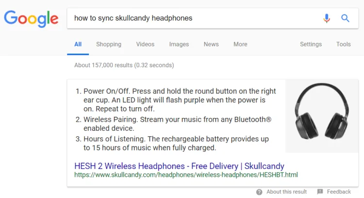
Appearing in featured snippets may help you rank for voice searches: 40.7% of all voice search answers came from a Featured Snippet. Example below.
It is early in the voice search game, but it is smart to be thinking about it.
To prepare for voice search think about the end user.
What type of questions are they asking?
What types of answers would they find helpful?
Once you identify this, create content that can help answer these questions.
Executive Summary
Smartphone usage continues to grow, so it is natural that Google is focusing on giving mobile users the best possible search experience.
According to Deloitte, in 2017, 93% of people check their mobile phone while shopping and 90% use it during leisure time.

That means that more people are on their phone while shopping than while lounging.
That’s huge – and the trend is only moving upward.
This is why it is important to think about mobile users NOW for your SEO strategy.
Keep up with necessary technical requirements, continue to follow best SEO practices, and always strive to improve user experience and page speed.

Kevin Jones is the SEO and content marketing manager at BigCommerce. He also dabbles in freestyle rapping and runs Pizza Need, a delicious website dedicated to his favorite food.